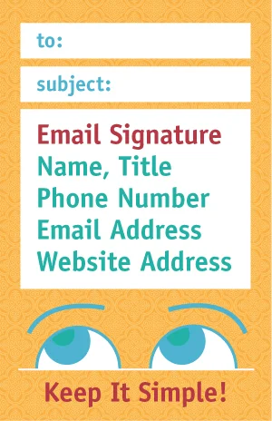
Some of you may be asking yourselves, "How important can an email signature be, really?" It seems like such a small issue, and that's probably why so many tend to overlook it. But it really is much more important than it appears on the surface. After all, the email signature not only provides important information to recipients, but it also affects the tone of all the emails your business sends out and reveals a lot about your level of professionalism, or lack thereof.
Perhaps the most common mistake people tend to make is being too lengthy. In today's Internet world, it's almost always better to be concise - and the same goes for email signatures. Typically, including your name, position, business URL, and contact information is plenty. As far as contact information is concerned, it's usually best to stick to the essentials - 2 phone numbers max (work and cell) and an email address.
EXAMPLE:
Joe Smith, Web Designer
www.smithjonesdesign.com | joe@smithjonesdesign.com
w: (001) 555-5589 | c: (001) 555-5768
Simple and clean, with only the necessary details for effective communication. Joe's recipients should have no trouble contacting him.
At the end of the day, the email signature is there to serve a specific purpose. It's the design of it and the content in it which can serve to either increase or decrease its effectiveness. This is part of the reason why most personal information should be left out - this is about your business, not your personal life.
Remember that it's called an email signature for a reason, not an email cover letter, so items not to include are:
- Home phone numbers
- Personal social media handles
- Images
- Well-known or well-liked quotes
- Special skill sets or other resume-type information
An exception to the No-Quotes rule may be your company's slogan. Just use your best judgment and don't allow it to make the email signature too bulky.
Inserting an image may seem like a good idea at first, since it adds a fun and personable flair, but many images are blocked in email anyway. Images (such as your logo and social media icons) also show up as attachments and make it hard to scan the attachments list to find the actual important attachment. Most importantly, your recipients won't be able to quickly copy and paste the information from the image for their own reference.
All that being said, don't limit yourself to a boring email signature either. Come up with a warm or cheeky sign-off phrase that is relevant to your business - just a few well-chosen words will go a long way. Make it personal by adding your own creative touch, while also taking into account spacing, color, size, vCards, etc. That way, your email signature won't distract the reader and take up space, but instead create consistency and make your correspondence more effective.
*Special thanks to Kat Neville at Smashing Magazine for being the inspiration for this piece.
Have a Pawsitively Tail Waggin' Good Day!
P.S. This information was provided by Ruff Haus Design - Your Loyal Marketing Companion. Established in 1997, we are a special breed of full service graphic design company that works with a premier pack of clients. We bring a fresh outlook and tail-wagging enthusiasm to your marketing program.


